
Welcome!
Craft is just important as content to me. Without everything I’ve learnt, none of this would have happened and I’m still learning so much as I go. So, in that vein, I wanted to share how I created a project I’m really proud of. If you don’t know what that is, go and check out my Halloween short story series, Seven Dreadful Tales before you read on. It’ll all make much more sense and you’ll avoid spoilers. If you’ve not seen the Part One blog post where I share some of the hidden links through the stories, that’s also worth reading to give you a fuller picture but not entirely necessary for you to understand this one.
A wee collection of short stories may not seem like much, but due to it being a last minute idea late one night, I only had a week prior to day one to prepare it all. So with that in mind, it was all systems go in the Land household (James was pretty relieved when it was over) and there was a lot of improvising.
I want to make the point that because of this and my zero budget (I gave you all this gift for free), this whole project was entirely created from things I already own and had access to (including staying safe and close to home). I even improvised a ruler and didn’t buy one until the end of the project after realising I really did need one! Yes, there were a lot of arts and crafts, we’ll get into that.
It used every skill I had and some I didn’t, so let’s talk about how it went.
Inspirations

My undergrad dissertation was on the tv series, Penny Dreadful. This is a culmination of gothic, Neo-Victorian, horror greatness that introduced me to penny dreadfuls themselves. For a quick definition of what these are, it is here, in Part One. I’ve also already discussed my love for monsters and gothic monsters in particular in a blog post here, so to save me rambling (which I could do on the topic all day), check that one out too.
Therefore, creating a horror series that combined all of the above elements, is probably the most ‘me’ thing I’ve ever done.
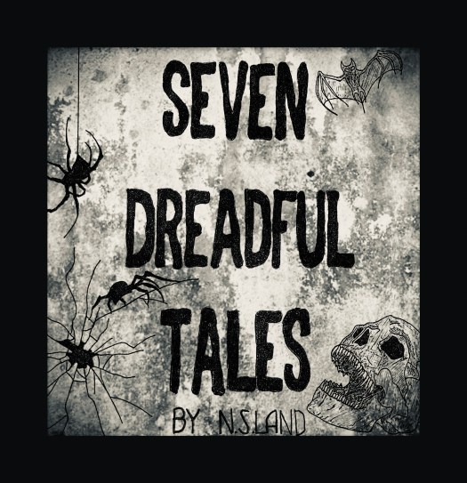
In my first blog post, I mentioned that Seven Dreadful Tales is my modern version of the Victorian penny dreadful. From form, to story and images, I took inspiration from these classics. This is most evident in the Seven Dreadful Tales cover image itself which uses font inspired by their covers. It also uses images of bats and skulls that were often depicted to entice audiences with the promise of fantastically gory and scary stories inside.
The stories themselves vary in length and style, some more gory than others but each a tale of drama and horror.
Of course, the tie that binds them all, the root of each character’s torment, is the penny dreadfuls they choose. This gives them a central role that is only clear at the end – a nod, if you will, to what started it all for me.
Form
I wanted to employ a variety of forms to bring a variance to the stories, setting them apart from each other and making them more of an interaction than simple reading. I also wanted to showcase the different forms that stories can come to us in today. They are not only confined to the pages of a book but reach us in ways that are more accessible to today’s culture.
Print was possibly one of the cheapest options for storytelling (other than spoken word, of course) in the nineteenth century. But now, it’s social media and websites.
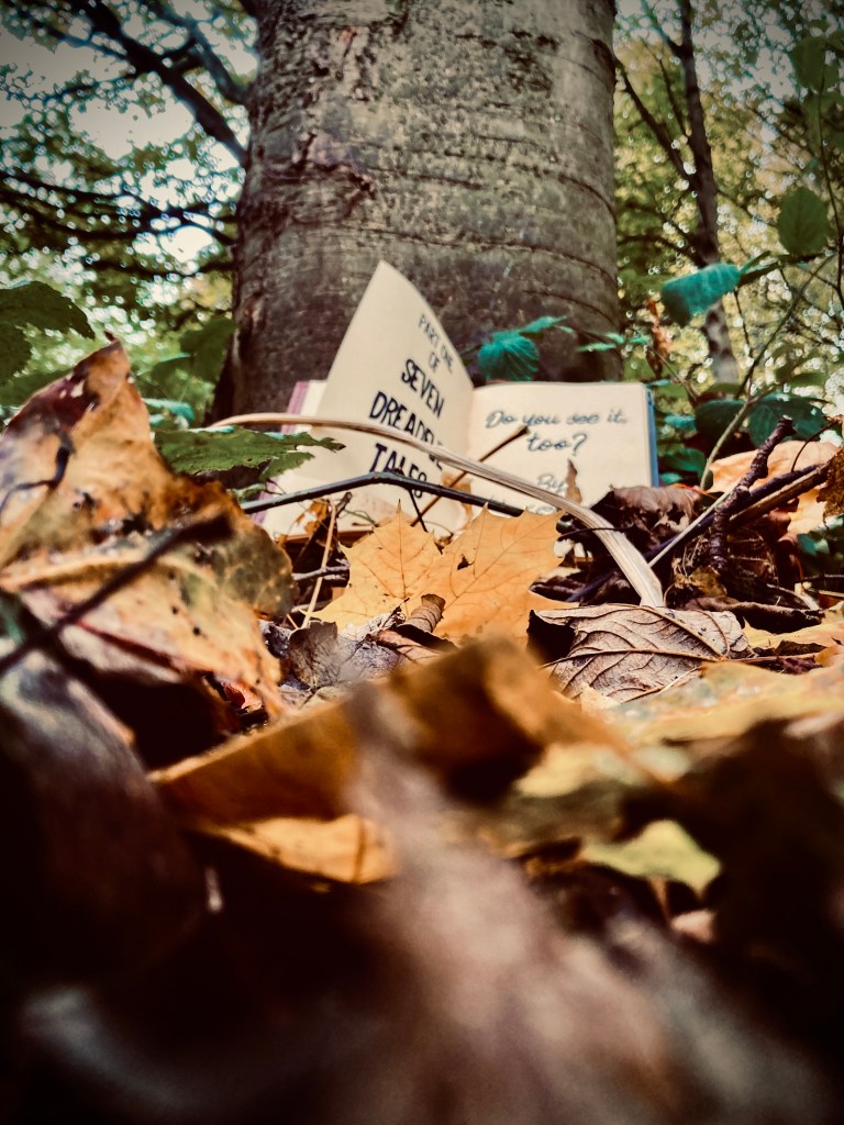
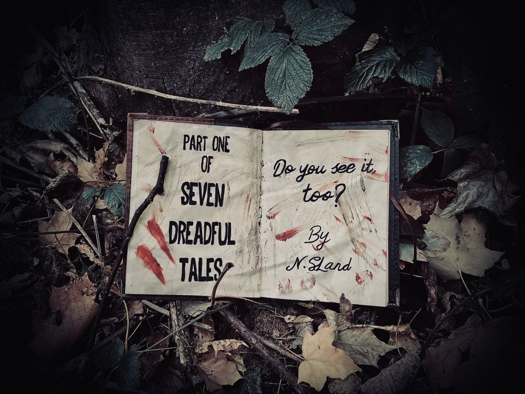
However, I did want to retain an element of the tradition, twisting this a bit as you see in Do You See It, Too? and To Do. These take on the most obvious change in form as I wanted to encapsulate the setting and atmosphere further by changing how they are told.
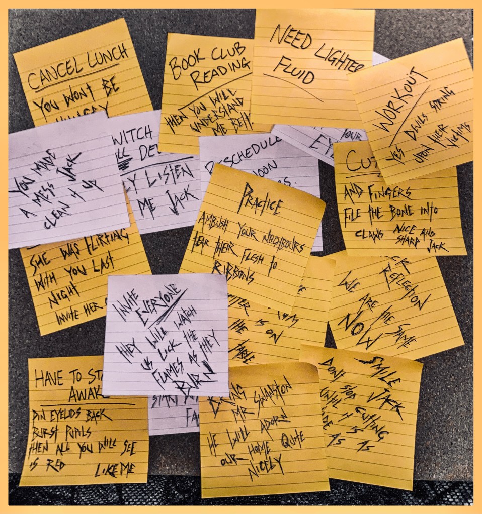
Devices like these can heighten a story if they are embraced fully which can sometimes be tricky. Keeping words legible in the above two stories was challenging while considering that Freya’s pages would not be pristine and neither would Jack’s post-its as they both descended into madness.
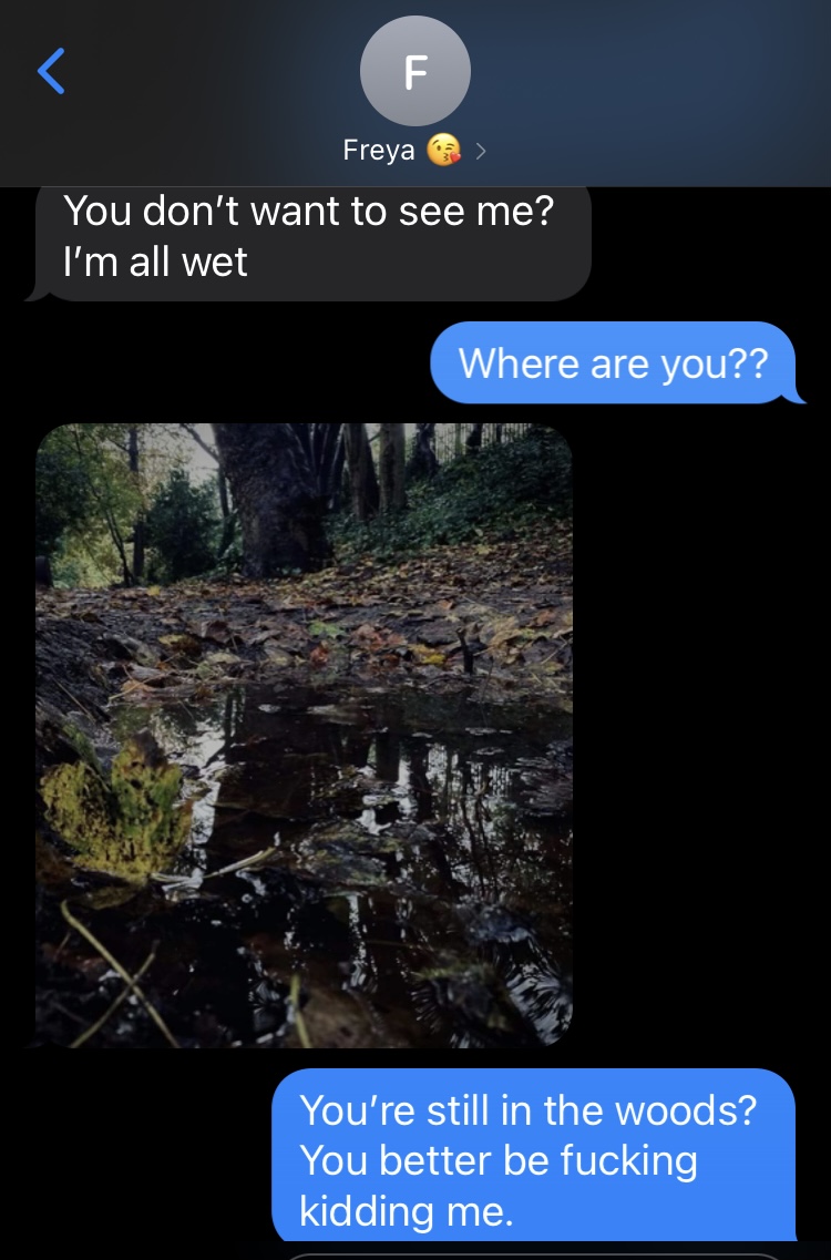
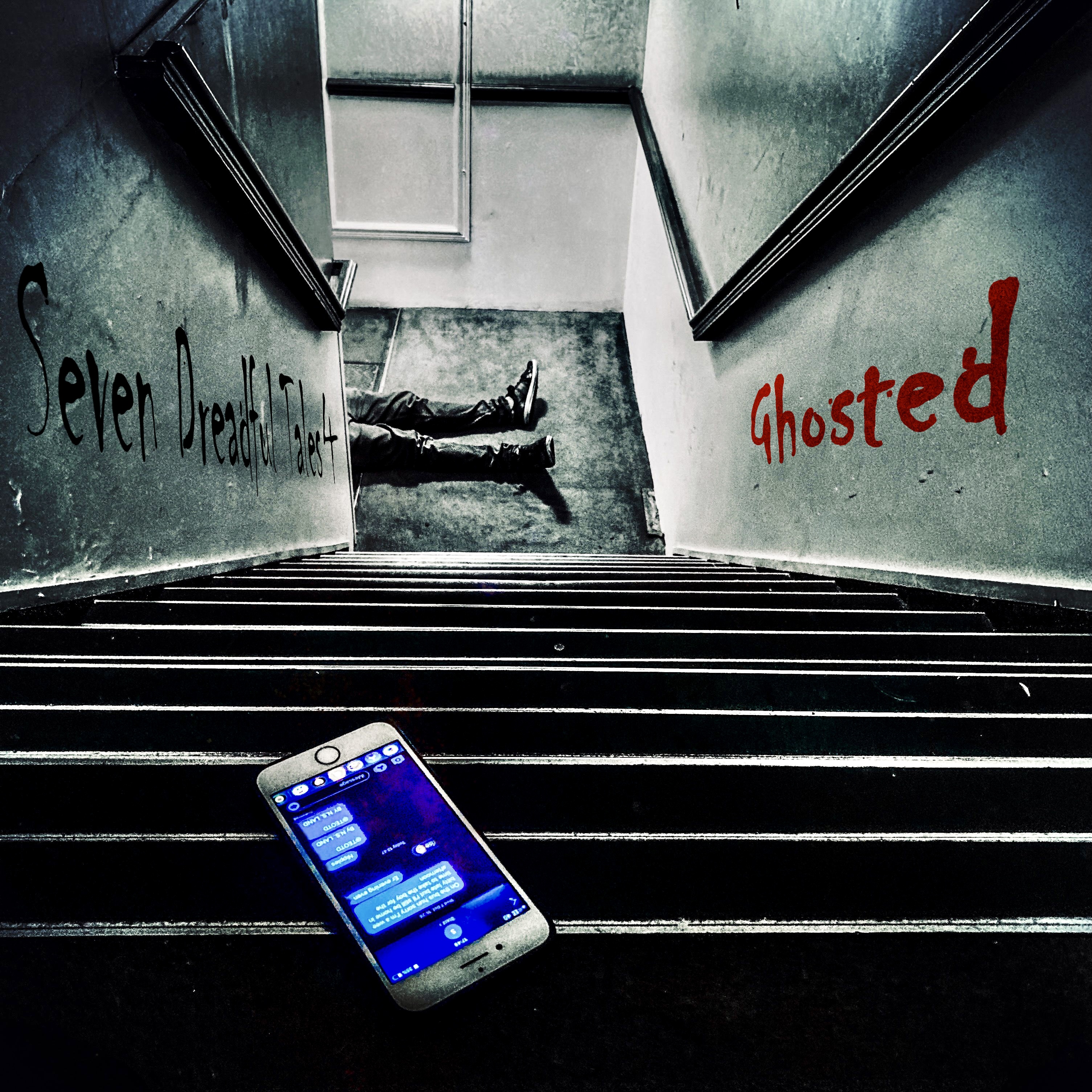
Using texts in Ghosted was easier in this sense but came with its own problems. I had to take into account time stamps, making sure the texts are sent apart from each other across a reasonable amount of time. But this medium also gave me the opportunity to include images which were useful devices in themselves.
In the cases of She Lives In The Ceiling and Cold Feet that take the forms of a journal and a forum post, it was easier so long as I kept the character and their audience in mind.
Anything that stuck out would have been jarring for you to read and this made it somewhat restrictive at times. We only saw Priyanka through the entity’s eyes and we only learnt information that Phil would deem suitable for Luke.
However, this can add to the suspense and is a great way to conceal information at the same time, hopefully making you all want to know more.
Story Design
I am a big planner, so plotting the stories, once I had the overarching penny dreadful theme, wasn’t too difficult. There were definitely some headaches when it came to mapping their order. I knew what I didn’t want. I wanted horror, not crime and these two can intertwine successfully but often crime can overshadow horror so I wanted to avoid crime completely.
The book club idea simply came from a friend who had been telling me about one she was part of recently. I thought it would be the best way to bring together a group of characters that may not necessarily meet otherwise or all agree with each other.
I also knew I didn’t want the stories to be chronological. I wanted to make you all work for it. But it was important that they linked while remaining separate. I knew not everyone would read all seven or in the same order as they are told, so there was no need to have them in a tight, unchanging order. Mixing them up meant it didn’t matter and someone who read one wouldn’t get lost or confused because they hadn’t read the one before. Yet, it also rewarded those who stuck through every story by adding that extra meaning for them.
To do this, all that mattered was that I knew the overarching story and the right order prior to writing. This enabled me to throw in all those fun hints and links I talk about in my other post, or subtext, to put it officially.
Are those images real?
Before this project, I was the type of person that would always forget to take pictures at a party or on holiday. I’m quite a visual person, I just forget to capture said visuals.

This has changed slightly since creating my Instagram where I’ve enjoyed filling it with images that inspire me and my work. However, it was nothing compared to the level of imagery required for Seven Dreadful Tales.
There were two main ways I created the visuals for this project; good old pen and paper, and photography.
Within those two categories lies a variety of types of images; from font, to special effects makeup and a lot of editing.
Pen and Paper…
This is what I started with. It provided a basis for editing and was literally where my only comfort zone lay. The main cover image is hand-drawn, as is She Lives in the Ceiling (although the latter is more purposeful to give the effect of a child’s drawing). Then, all the images from Do You See It, Too? are drawn/written into one of my favourite notebooks. This gave it a more real effect, as if Freya herself had scrawled the notes in her panic through the forest.
However, drawing wasn’t ideal because it only gave me one chance to get it right. Editing can fix a multitude of things, but not all, particularly at the level I was working at. At one point, I lost several of the last pages of Do You See It, Too? and tore one when rubbing it in the mud. This meant going home, rewriting them and returning to shoot them again the next day. Those early days were definitely the most time consuming and headache inducing.
Where did you take that photo?
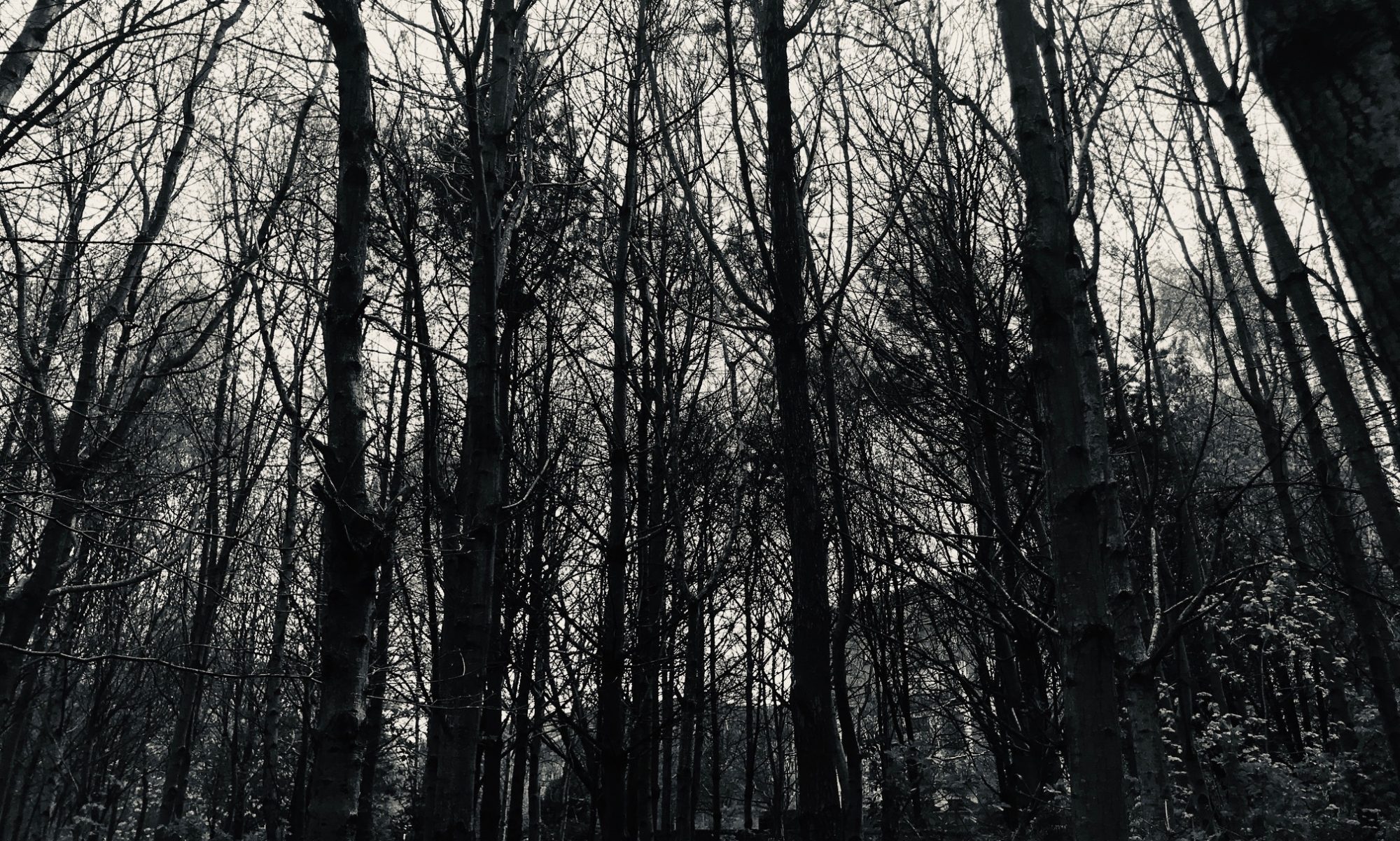
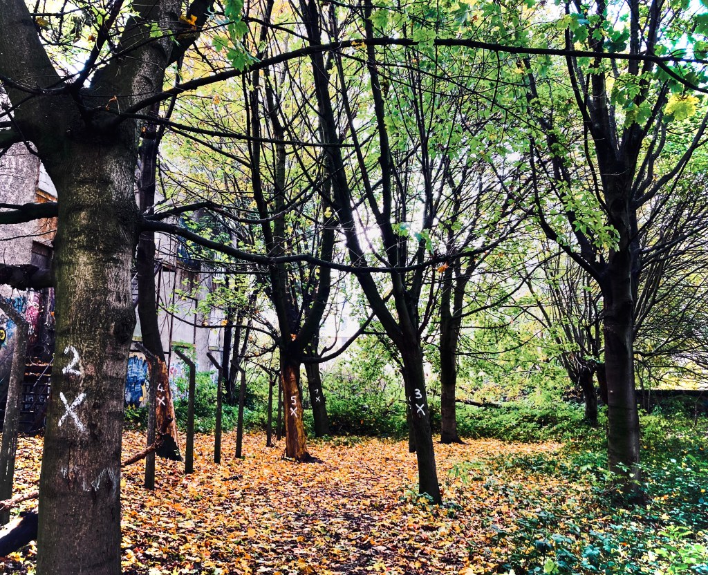
Locations were fun. I am so fortunate to live in such a beautiful city and Edinburgh has such a balance of beautiful forests, parks and architecture. I was spoilt for choice when it came to choosing a location for Do You See It, Too? but after trialling a few, I settled on one that strangely had seven numbered trees when I arrived. Spooky.
The trees were close enough for the background to look like you could get lost, without being so cramped that I was confined to a certain backdrop. The autumn leaves only made it more picturesque.
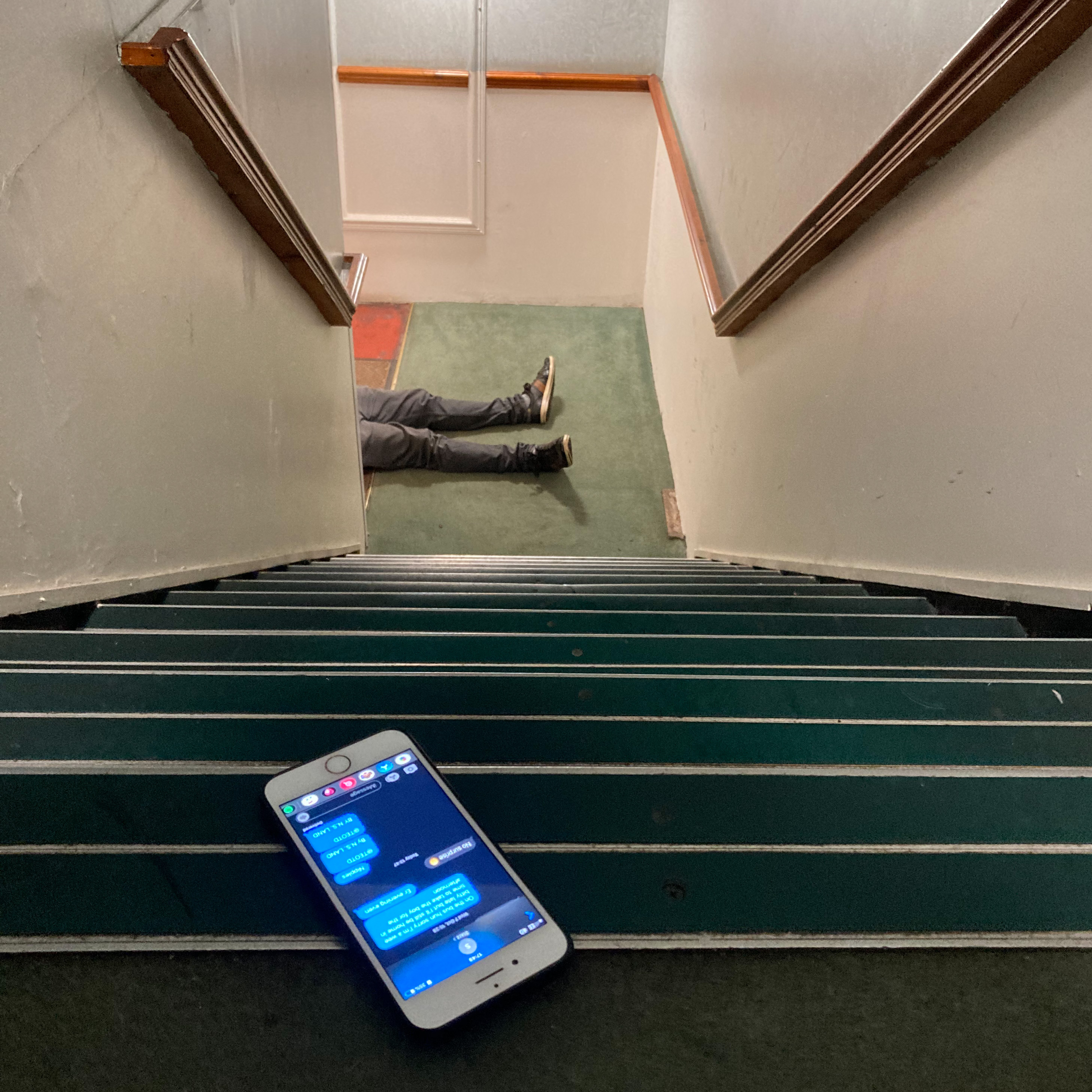
The rest were shot in my wee flat across various surfaces, with my trusty fake blood. Even Ghosted got me some strange looks from neighbours on the stairs.
My flat has very poor lighting so it was a lot of trial and error to get the right angle. Each story lent itself to an image in my head which often needed adjustment in practicality. I should also note that I used my phone to take all of these pictures and it’s not even a new phone either.
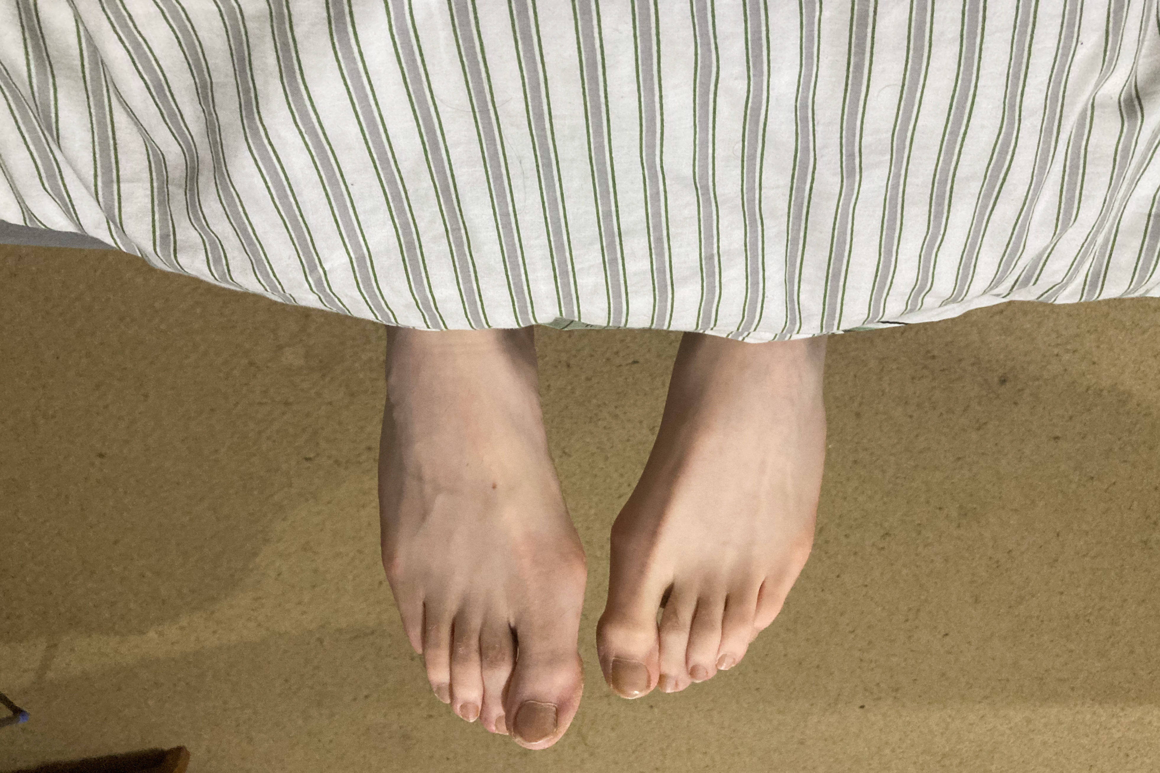
Slide the image below to see the before and after…those are not my long legs.
Is that your face in My Skin Feels Different?
It is! And I’m sad to say, a book was indeed harmed in the making of My Skin Feels Different. Special effects makeup has been a wee hobby of mine for a few years now and I usually only make time for it at halloween. With this year’s halloween plans taking a backseat, I still wanted to play with makeup for this story.
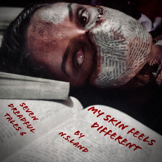
I had a few ideas but that’s all they were. I had no idea if it was possible to mould book pages to my skin. With an arm test, it seemed like it had potential so I went ahead, again without much of a plan. This uses liquid latex which dries clear, in a bit of a paper maché technique to create the mouthpiece. It then creates a barrier between your skin so you can cut at it, creating wounds. Colouring after that consists of creating bruising and bleeding to blend it further as I wanted some of the parts of my chest to seem as if the pages had been peeled or cut away.
I actually loved the result although struggled to capture it quite as well on camera. As you can see, the piece covers my mouth and nose. I managed to leave a tiny gap in the paper beneath my nose but I really couldn’t breathe well so had to be careful when posing and building the scene, stopping to take literal breathers where I could. With one contact lens in too, I could only see out of one eye. Needless to say this was an impractical Halloween costume.
But I got my shots.
How are they edited?
As I said, I’m no photo editor. In fact, I didn’t really have a system or software that I used before this. In ambitious fashion, I began using the Photoshop app. Let’s get one thing straight, I can’t use desktop Photoshop – at all. So, while the app is much different and simpler, it still took some getting used to. Filters were my friend as I got to grips with the style I wanted and could then progress to editing more specific features and layering.
However, because I wasn’t the best editor, it was more important for me that I was working with a stronger base picture to begin with. This helped so much, meaning all I used editing for was adding text and changing colouring.
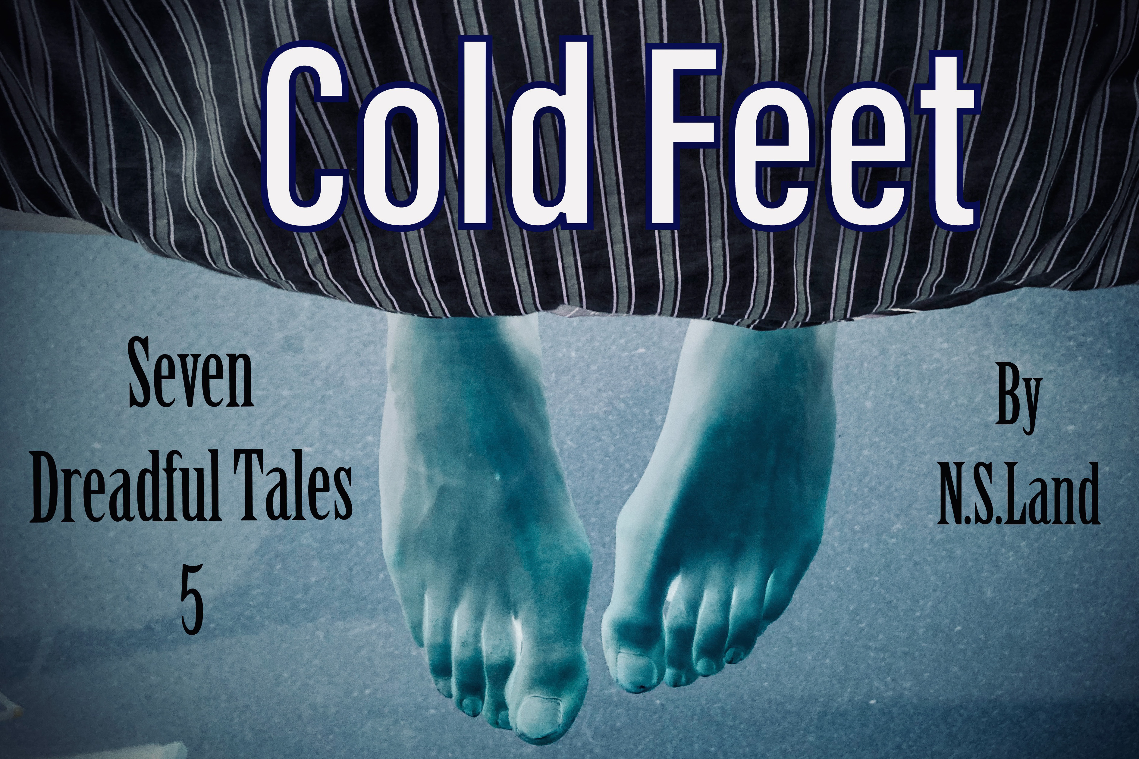
Some of my favourites are the more simplistic ones. Not necessarily simple to create but to look at. The covers of To Do, Cold Feet and The Book Club aren’t as busy as the rest and while not quite as gruesome or eerie as others, they are clear and concise in their message.
Slide below to see the before and after…again, not my feet.
However, My Skin Feels Different takes first place in terms of my favourite story and visuals. As one of the last stories I created, it brings together everything I’d learnt along the way and I believe is the strongest. It is very typically, my style in every way.
This has been such a fun project and I’ve loved all of it, especially reading your reactions and watching you all take the journey of each story. I want to thank you all again for following along, sharing, reading and interacting on any level with Seven Dreadful Tales.
At the beginning, I worried I’d been over-ambitious as usual. Now, at the end of it all, I realise that without ambition, I wouldn’t have achieved any of this. The challenge has pushed me to learn so much more about my craft, and I’ve fallen in love with it all over again.
See you at Christmas…maybe…
